
Product Labeling and Packaging Concepts
Definition of product labels and their role in packaging
Labels are more than ink on a box; they’re the first handshake with the buyer—a whisper from the shelves. In label packaging, a product’s identity is declared in a glance, guiding decisions in a heartbeat. A veteran packer says, “The label is the product’s passport—read it and you know where it came from, what it contains, and how it should be used.”
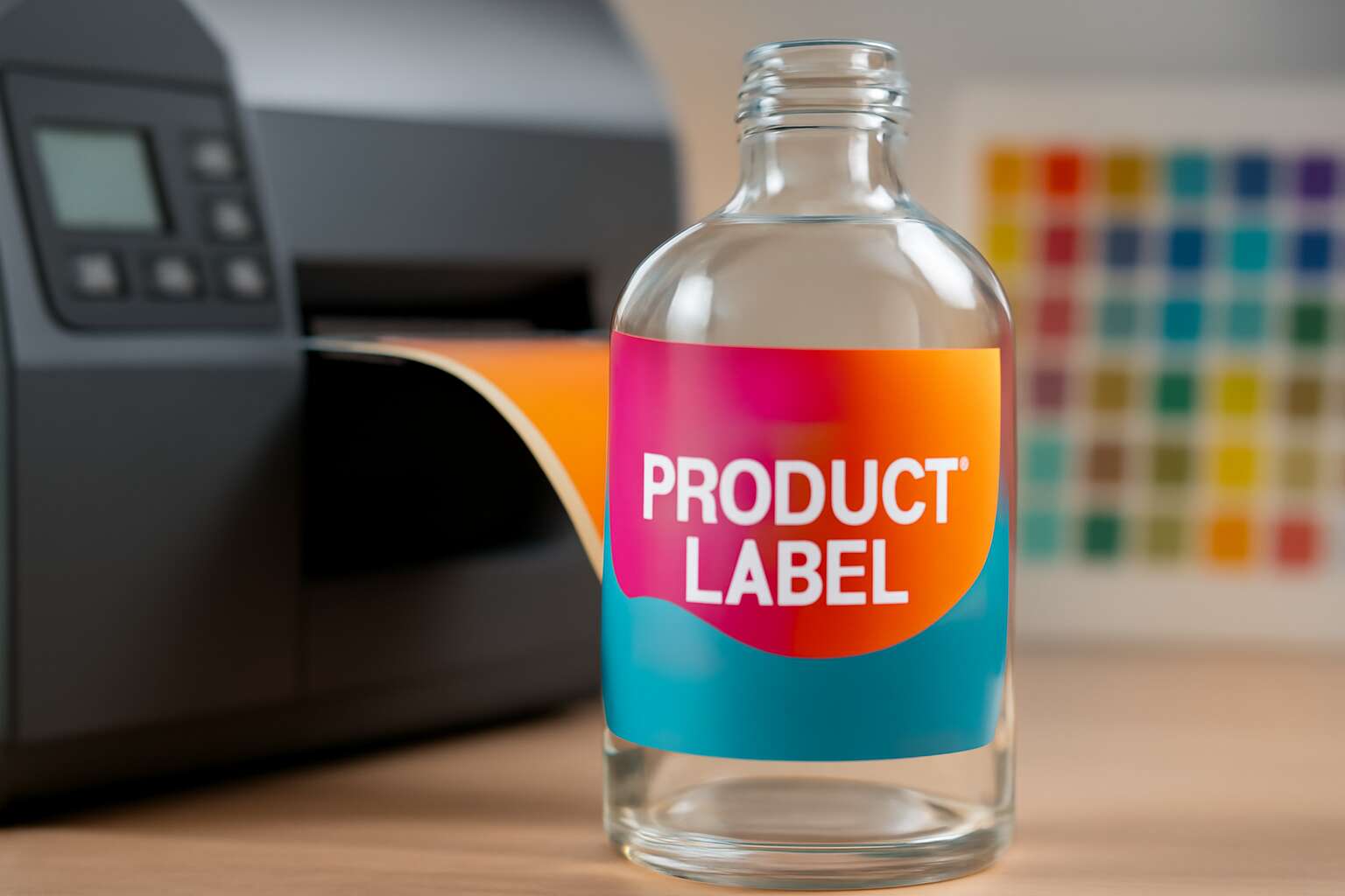
Definition of product labels: printed or embossed data that identifies a product, conveys usage, ingredients, weight, batch, expiry, and safety warnings. Their role in packaging is to inform, protect, and persuade—linking branding with compliance and trust. In South Africa, label packaging must be legible, multilingual, and compliant across formats from cartons to codes.
- Data elements
- Regulatory basics
- Brand perception
- Print durability
Durability and legibility shape how labels perform—from cartons to PET bottles. The packaging must blend aesthetics with data integrity, aligning with retailer expectations and SA realities.
Integration of labeling with packaging design
On South African shelves, a label’s influence begins the moment eyes land on the box. Shoppers form impressions in an instant, and the whisper of a well-crafted label can tilt a decision before a single breath is drawn. A veteran packer might say, “the label is the passport—read it and you know the journey.”
Integrating labeling with packaging design means orchestrating visual hierarchy, material choice, and data density into one living surface. This integration anchors all decisions in label packaging.
- Visual hierarchy that guides scanning of usage, ingredients, and expiry
- Material and finish choices that preserve legibility from chilled shelves to display cases
- Compliance cues and multilingual typography that stay faithful to brand voice
From cartons to PET bottles, the duo must endure retailer expectations and SA realities. In branding, the label packaging becomes part of the product’s story, shaping perception and trust.
Lifecycle stages from concept to fulfillment
On South African shelves, a product’s first impression can arrive in a heartbeat. A shopper decodes type, tone, and promise in seconds, and the lifecycle of labeling threads through every decision, turning raw concept into a surface that speaks of trust and provenance.
- Concept brief and regulatory mapping to ensure the label speaks truthfully to ingredients, allergens, and local SA constraints.
- Artwork development and data architecture, shaping typography, color, and data zones for legibility on chilled aisles.
- Prototyping, mockups, and perception testing to validate visibility, readability, and brand voice before production.
- Compliance review and multilingual typography that stays faithful to brand while meeting regulatory obligations.
- Production and label packaging integration, choosing materials and finishes that preserve legibility from shop floor to display.
- Fulfillment readiness, shelf-ready packaging, and retailer-grade labeling to streamline distribution and restocking.
In SA, this lifecycle must dance with regulations and retailer expectations.
Key terms every brand should know
In the South African marketplace, first impressions arrive in a heartbeat. Three seconds is all it takes for a label to signal trust or spark doubt. label packaging becomes a delicate dialogue between brand promise and consumer perception, especially on chilled aisles where contrast and clarity decide what the shopper notices first.
Here are the terms that shape that dialogue, beyond the basics:
- Substrate compatibility and print fidelity for real-world wear
- Color management and legibility in low-contrast, cold-store lighting
- Data architecture: zoning, barcodes, and QR code strategies
- Packaging sustainability signals: recyclability, compostability, and tamper-evident cues
Mastery of these concepts turns a plain surface into storytelling—compliance becoming confidence and the brand voice traveling from shelf to story with clarity and charm.
Materials and Sustainability for Labels
Label materials: paper, film, and foil options
Labels carry more sway than the font on a bottle, and the crowd decides in seconds. A recent study suggests 70% of purchase decisions hinge on label appearance. In label packaging, sustainability is a differentiator—paper, film, and foil options define both impression and footprint!
Here’s a quick snapshot of two material families and how they balance aesthetics with conscience:
- Paper: FSC-certified or recycled content, ink-ready, widely recyclable with standard streams, great for short to mid runs.
- Film: PP or PET variants that resist moisture and tears; barrier properties vary; recyclability depends on local facilities.
Foil options bring premium shine—aluminium or metallized finishes—but can complicate recycling and end-of-life sorting. For SA brands, this is where a thoughtful adhesive and a clear end-of-life path matter as much as the finish itself.
Substrates and adhesives compatibility
A solitary glance can seal a sale; in South Africa’s aisles, packaging and ethics duel for the moment the eye lands. One study puts the influence at 65% of purchase decisions—the label’s finish guiding the crowd, and I’ve watched that magic unfold!
Substrates and adhesives must be attuned, so the right adhesive respects paper’s fibres, nylon-like films, or metallized surfaces. Compatible pairings reduce migration, withstand heat and humidity, and ensure the label packaging stays legible long after the shelf lights fade.
In South Africa, the end of life is part of the design. The chemistry of adhesion, the recyclability of film or foil, and local facilities define whether a finish is a gift to the planet or a footnote.
Sustainable and recycled label solutions
In South Africa, 65% of purchase decisions are swayed by the label finish, proof that first impressions linger longer than shelf life. The label packaging moment fuses aesthetics with ethics, turning every surface into a tiny sustainability pitch.
Materials chosen for packaging labels matter for planet and profit. Recycled-content paper, PCR films, and water-based inks curb the footprint, while coatings designed for recyclability keep the loop intact.
- 100% recycled paper options
- films with post-consumer recycled content
- biodegradable or compostable label laminates
In South Africa, end-of-life considerations shape design: the chemistry of adhesion, recyclability, and local facilities determine whether a finish is a gift to the planet or a footnote.
Smart, sustainable label solutions align brand goals with circular economy principles, delivering legibility and ethics in equal measure.
Regulatory considerations for materials
Regulatory considerations for materials guard the beauty and reliability of label packaging, guiding choices from the ink to the laminate. In South Africa, this means inks that are clean at the press, adhesives that perform without compromising recyclability, and coatings that play nicely with local recycling streams. The goal is legibility that lasts and a footprint that does not retreat from responsibility.
To navigate compliance, teams track these touchpoints:
- Safety data and ingredient transparency
- Adhesive chemistry and recyclability impact
- Food-contact and consumer-safety standards
- Local facility compatibility and end-of-life options
With a lyrical pragmatism, we marry performance with planet, letting ethics and craft speak through every surface.
Design, Compliance, and Accessibility
Legibility and typography best practices
In two seconds, a label speaks volumes—the difference between a passerby and a purchase rests on its first impression. Design acts as the brand’s hinge on the shelf, where color, imagery, and hierarchy whisper the product’s story. When label packaging aligns, credibility follows.
Compliance anchors design in truth and regulation. Clear declarations, allergen notices, and honest claims protect consumer and brand, while alignment with regional and global standards smooths market access. The boundary between aesthetics and disclosure remains precise; accuracy guides packaging integrity.
Accessibility, legibility, and typography form the human interface between product and reader. High-contrast color, generous line-height, and a thoughtful typographic hierarchy ensure data is legible at a glance. For South Africa’s diverse shoppers, inclusive design matters.
Regulatory compliance and labeling standards
Two seconds. Label packaging speaks volumes, deciding between a passerby and a purchase. Design acts as the brand’s hinge on the shelf—color, imagery, and typographic rhythm whisper the product’s story, and credibility follows when it aligns with instinctive perception.
Compliance anchors design in truth and regulation. On-pack declarations should be precise, and regional labeling standards aligned with global norms smooth market access across South Africa and beyond. The boundary between aesthetics and disclosure remains exact; accuracy preserves packaging integrity.
- Clear disclosures that respect local languages
- Region-specific labeling norms aligned with global best practice
- Auditable records that build consumer trust
Accessibility, legibility, and typography form the human interface between product and reader. High-contrast color, generous line-height, and a thoughtful typographic hierarchy ensure data is legible at a glance. For South Africa’s diverse shoppers, inclusive design matters.
Accessible labeling for diverse audiences
In seven seconds, a shopper decides whether to pick up a product. In label packaging, color, imagery, and typographic rhythm whisper the product’s story before a reader touches it. I watch bold hues and quiet emblems bend perception, turning a passerby into a purchaser with a single glance.
Compliance anchors that design in truth. On-pack declarations must be precise, with region-specific labeling aligned to global norms so South Africa opens doors to new markets. I feel the boundary between aesthetics and disclosure tighten into trust when accuracy never slips.
Accessibility makes the reading experience human. High-contrast color, generous line-height, and a thoughtful typographic hierarchy keep data legible at a glance for diverse shoppers across language and literacy levels in South Africa. Inclusive design isn’t an afterthought—it’s a promise to every reader.
Barcodes, QR codes, and serialization
In a market obsessed with first impressions, label packaging design must balance aesthetics with traceability. Barcodes, QR codes, and serialization aren’t mere afterthoughts—they anchor compliance and accessibility, whispering a product’s provenance before a shopper touches it. On South African shelves, a clean scan and clear data can open doors to new markets!
Design choices for codes are quiet yet decisive:
- Barcode placement that respects product flow, provides fast scans, and preserves visual rhythm
- QR codes sized for legibility and linked to accessible content that explains the product clearly
- Serialization schemes that fit tracking, recall readiness, and regulatory reporting across borders
In practice, the right integration preserves brand voice while satisfying regulators and readers alike; design, compliance, and accessibility converge on that single narrative. When done with intention, this approach to label packaging builds trust that travels with the product.
Printing Technologies and Production
Digital vs. flexographic printing for labels
Every label packaging project is a tiny stage with bright lights; in South Africa, digital printing can slash setup times by up to 50%, turning concepts into ship-ready labels in days. “The label is the first handshake with a customer,” says a seasoned local printer.
Digital printing excels for fast, customised runs with minimal plate setup, ideal for limited editions or regional campaigns in label packaging. Flexographic printing offers consistency and speed for long runs and a broader range of substrates, from textured papers to foil-embellished films.
- Run length and cost per unit
- Substrate compatibility
- Color accuracy and finish
- Turnaround time and supply chain
Together, these technologies weave flexibility into a brand’s story, letting products travel from concept to consumer with finesse, precision, and a touch of artistry.
Color management and accuracy
Color fidelity on label packaging can lift brand recall by up to 40%. In a crowded shelf, a precise hue becomes the brand’s handshake with the shopper. Printing technologies—from digital color control to robust RIPs and inline spectrophotometers—keep logos and fills consistent across runs, even on challenging substrates like translucent films or metallic foils.
Production color management and accuracy hinge on a few core ideas.
- ICC profiles tailored to each substrate
- Soft proofing and on-press verification via inline spectrophotometry
- Strategic use of spot colors for metallics, foils, and clear finishes
These elements help ensure the label packaging reads the same from first to last run, every time.
Printer substrates and finishes
Shelf presence is won in milliseconds: consistent color and a flawless finish make your label packaging speak before shoppers even skim the copy. Modern production printers leverage digital color control, robust RIPs, and inline spectrophotometers to lock logos and fills across substrates—from translucent films to metallic foils. Newer printing technologies—UV LED, high-opacity whites, and multi-pass curing—open doors to durable labels that survive chill cabinets and humid SA climates without color drift.
When selecting substrates and finishes, think beyond the run. Production printer choices define how well these labels resist abrasion and preserve legibility with variable lighting.
- Substrates: PET, polypropylene (PP), BOPP and specialty papers
- Finishes: matte, gloss, satin, soft-touch
- Special effects: metallics, foils, clear coats
Aligning these elements with your brand story yields tactile credibility on shelf and on screen.
Quality control and testing methods
Retail clocks blink fast, yet three seconds can crown a brand or fade it. In the realm of label packaging, printing technologies fuse speed with scrutiny, turning every run into a measured performance. Production teams employ rigorous checks during setup and in-line sampling to shield logos, type, and color from drift, ensuring you are ready for any shelf.
- Adhesion and substrate compatibility testing
- Flex, abrasion, and scuff resistance under cold and humid conditions
- Color stability and legibility across variable lighting
Quality control and testing methods translate design intent into durable, readable labels—vital in South Africa’s diverse markets where store lighting and climates swing from coast to city. When the process is precise, the story travels cleanly, from factory floor to consumer hand.
Trends, Marketing Impact, and ROI
Brand storytelling through label design
Trends in label packaging are rewriting the rules on South Africa’s shelves, where culture meets commerce. Designers blend tactile finishes with local motifs, turning product IDs into miniature stories. From Cape Town to Johannesburg, packaging cues speak in color and rhythm.
- Tactile textures inviting touch
- Heritage-inspired color stories
- Subtle metallics for premium appeal
Marketing Impact: A label that tells a coherent story cuts through noise, driving faster shelf recognition and higher online engagement. Consumers skim while scrolling and linger when brand values align with real-life moments!
ROI Brand storytelling through label design: The payoff is a durable lift in perception and price integrity. A well-crafted label can lift baskets, deepen loyalty, and extend shelf life in hearts as much as on shelves, delivering measurable returns in a crowded market.
Smart labels and RFID integration
South Africa’s shelves are being rewritten by label packaging that reads like a micro-story in color and texture. Trends fuse tactile finishes with local motifs and ready-for-smart-scan surfaces, turning every product ID into a miniature fable that travels from Cape Town to Joburg.
- RFID-enabled tracking
- Interactive codes linking to stories
- Sustainable, locally inspired finishes
Marketing Impact: A cohesive label packaging narrative cuts through the clutter, boosting shelf recognition and online engagement as consumers pause longer when brand values align with real-life moments!
ROI: Smart labels and RFID integration convert perception into loyalty, lifting baskets and price integrity. In South Africa’s crowded markets, the future belongs to labels that link stories, stock data, and smooth fulfillment, delivering measurable returns with every scan.
Sustainability as a value proposition
A recent study suggests that memorable label packaging can boost shelf recall by up to 30%, a punchy reminder that stories sell. On South Africa’s shelves, tactile moments and local motifs turn labels into micro-dramas that linger with shoppers long after the trolley passes.
The marketing impact unfolds as brands gain dwell time and online engagement when the label speaks to real-life moments. I see how a coherent narrative that aligns with everyday South African life invites curiosity and trust at first glance—it’s not about noise!
ROI rides on sustainable aesthetics that cultivate loyalty and smoother fulfillment. When packaging fuses responsible materials with authentic local flair, price integrity grows, waste declines, and baskets swell as shoppers reward brands that walk the talk.
Measuring ROI from packaging optimization
Trends in label packaging whisper of tactile luxury and local poetry on South Africa’s shelves. Brands are leaning into embossed textures, warm earth tones, and motifs drawn from township markets and Cape sunsets. The label packaging narrative becomes a collectible moment, inviting touch and trust.
- Tactile finishes and textured substrates that invite touch
- Local motifs and bilingual typography that speak to everyday life
- Smart codes and small storytelling trays unlocking shelf-side micro-dramas
Marketing impact unfolds as dwell time lengthens and online engagement climbs when the label speaks to real-life moments. We notice that a coherent narrative aligned with everyday South African life sparks curiosity and trust at first glance—it isn’t noise; it is resonance.
ROI from packaging optimization grows when sustainable aesthetics meet authenticity. We see price integrity tighten, waste shrink, and baskets swell as shoppers reward brands that walk the talk, turning label packaging into loyalty.



0 Comments