

Packaging Box Materials and Core Options
Corrugated Cardboard: Strength, Cost, and Use Cases
“The box for packaging is the handshake before the product,” a designer once told me, and in South Africa’s crowded shelves that handshake travels far. More than 60% of product damage happens in transit, so the structure you choose matters as much as the contents.
Packaging Box Materials span kraft and recycled fibers, but corrugated cardboard remains the backbone. Core options vary by flute: A and BC for strength, and E-flute for lean, cost-conscious lines. The right core balances protection with cost, translating into fewer damaged units and happier customers across the country.
- A-flute
- BC-flute
- E-flute
In South Africa’s logistics landscape, use cases vary: single-wall suits lightweight consumer goods; double-wall supports electronics; triple-wall guards bulky or high-value shipments. This is why a well-chosen box for packaging matters in SA supply chains.
Folding Cartons for Lightweight Packaging
“A carton is a product’s first whisper,” a designer once told me. Folding cartons—light, adaptable paperboard that speaks before any label—carry branding with quiet authority. They span folds of folding boxboard (FBB), solid bleached sulfate (SBS), and recycled blends, and they welcome coatings from matte to barrier finishes.
In South Africa’s shelves, core options translate into crisp print, reliable folding, and just-right stiffness for lightweight packaging. A well-chosen material reduces glare on the shelf and smooths handling in transit—the sum total of a successful box for packaging.
- Folding boxboard (FBB) for smooth folds and bright ink
- SBS for premium whiteness and high print fidelity
- Moisture-barrier coatings for damp or humid routes
Rigid Boxes: Premium Appeal and Protection
Shoppers form first impressions in as little as three seconds, and the box for packaging carries that message with quiet authority. Rigid boxes offer premium presence without bulk, built to endure handling while elevating shelf appeal. A solid core wrapped in paper or coated finishes delivers stiffness, while a subtle matte or gloss communicates brand values at a glance.
Core options anchor premium appeal and protection. Solid chipboard provides rigidity; SBS wraps deliver brightness and high print fidelity; moisture-barrier laminates guard damp routes. In South Africa, crisp print, dependable construction, and reliable transport shape what ends up on the shelf.
Core options include:
- Solid chipboard core
- SBS or premium white wraps
- Moisture-barrier coatings
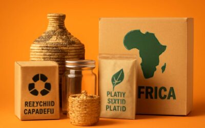
Kraft and Recycled Boxes: Sustainability and Aesthetic
Shoppers decide in the first three seconds, and the box for packaging becomes the narrator of a brand’s story. In South Africa, kraft and recycled boxes carry that tale with quiet authority—earthy textures, sturdy construction, and a footprint gentler on the land. These materials fuse sustainability with aesthetic, turning a simple carrier into a statement of values that resonates on shelf edges and in-hand encounters.
Core options within Kraft and recycled families reveal texture and strength without compromising print clarity:
- Natural kraft with a tactile grain
- Recycled content blends for bright, clean prints
- Uncoated finishes that ease the recycling process
Finish and ink choices weave the narrative further; soy-based inks and minimal coatings guard the environment while preserving color fidelity in a box for packaging that feels both timeless and contemporary.
Alternative Materials: Plastic, PLA, and Compostable Options
Three seconds—it’s all it takes for a shopper to read a carton and decide whether the box for packaging is a story worth taking home. In South Africa, the box for packaging speaks volumes—it’s a tactile handshake that invites trust. The choice of materials matters beyond cost, shaping recycling streams and memory on shelf and in hand.
Beyond traditional paperboard, alternative materials balance function with footprint:
- Plastic: durable, lightweight, and highly printable; availability of local recycling streams and programs influences its viability on the ground.
- PLA: compostable bioplastic from plant matter; suitability depends on access to industrial composting facilities to realise its advantages.
- Compostable options: certified compostable coatings or films that break down in industrial facilities, leaving minimal residue.
When design leans toward calm, a box for packaging crafted with these materials can achieve a modern, earth-friendly look without sacrificing durability or color fidelity.
Design and Branding Considerations for Packaging Boxes
Brand Identity: Color, Typography, and Logo Placement
On crowded shelves, a single glance decides a sale. Your box for packaging becomes a silent ambassador, speaking before a word is read. Brand identity thrives where color, typography, and layout collide, guiding emotions from curiosity to trust in a heartbeat. In South Africa’s competitive retail, authenticity wins loyalty!
Color carries mood and shelf direction; typography speaks legibility and tone; logo placement seals recognition.
- Color palettes that reflect the brand and environment
- Typography with clear hierarchy for product name and details
- Logo placement that anchors visibility on pack edges
When these elements align, the packaging tells a coherent story—distinct on the shelf, seamless online, and unforgettable in person.
Structural Design: Flaps, Inserts, and Tamper-Evidence
On South African shelves, the box for packaging is more than protection—it’s poetry in three dimensions. ‘The package speaks before a word is read,’ a veteran designer once told me, and I felt the truth land with a flourish of trust. I watch the flaps unfold with quiet grace; the unboxing begins here.
Designing for structure means choreographing flaps, inserts, and tamper-evidence into a seamless choreography.
- Flaps that provide a clean opening and structural durability
- Inserts that cradle the product and guide disposal or repackaging
- Tamper-evidence features that reassure without complicating the user journey
Such choices anchor branding in tactile reality—every touchpoint reinforcing the story you tell, in a market as competitive as South Africa’s.
Print Methods: Digital, Offset, and Screen Printing
In South Africa’s crowded shelves, the box for packaging is a stanza written in ink and carton. A veteran designer once whispered, “The package speaks before a word is read,” and I felt the hush of that truth linger. Print choices become the hue of memory, guiding the brand through the unboxing ritual!
Design and branding considerations hinge on the method: digital, offset, and screen printing sculpt texture, color, and personality. The right method aligns with identity and budget, shaping how the story lands in every home.
- Digital Printing: fast, flexible, ideal for small runs or personalized packaging boxes.
- Offset Printing: deeper color, consistent tone, economical at scale for larger campaigns.
- Screen Printing: tactile ink layers and bold textures for premium finishes.
Choose the mood with intention; ink, finish, and fold cohere into a memorable moment.
Layout and Die-Line Best Practices
In South Africa’s crowded shelves, the box becomes a voice before the first word is read. “The package speaks before a word is read,” a veteran designer once whispered, and that truth still lands with a quiet punch.
Layout and die-line best practices demand clarity: consistent margins, precise bleed, and vector accuracy; every fold line and tuck tab must align with the carton anatomy. When designing for a box for packaging, keep safe zones away from edges to prevent logo clipping and ensure readability across sizes.
Key die-line considerations:
- Bleed and trim accuracy to avoid white edges
- Safe zones and logo clearance for readability
- Color separations and proofing steps to prevent surprises
With these in place, the layout safeguards brand voice and shelf appeal for the box for packaging, ensuring legibility from a distance and its integrity in transit.
Accessibility and Consumer Experience
On crowded South African shelves, first impressions sprint past your tagline and land squarely on the box. Design for accessibility isn’t a buzzword; it’s a consumer experience strategy. Bigger, sharper type, high-contrast color, tactile cues, and multilingual copy turn a glance into trust. The box for packaging should guide the eye and the hand, inviting comprehension before the product is picked up.
To balance brand voice with usability, consider these design levers:
- Ergonomic opening and reseal cues to reduce fiddling at the counter
- Readable copy and strong contrast for legibility from a distance
- Simple pictograms that convey function without words
- Clear, inclusive language across multiple markets
A well-balanced box becomes a brand whisper—clear, confident, and a tad rebellious in a sea of sameness.
Sustainability and Compliance in Box Packaging
Material Sourcing and Recyclability
Packaging isn’t just wrapping—it’s a contract with tomorrow. In South Africa, sustainability in the box for packaging supply chain isn’t a slogan; it’s a compliance trigger and a trust signal. Smart sourcing means verified FSC or PEFC chains, local procurement to cut transport emissions, and materials designed for recyclability from design onward. The box for packaging that travels from factory to pantry must perform without a heavy carbon footprint.
Compliance checkpoints keep the scheme tidy and auditable. In SA, Extended Producer Responsibility and waste regulations frame the playing field; transparent sourcing helps brands avoid greenwashing and gain consumer confidence. Here are quick checkpoints:
- certified fiber sourcing (FSC/PEFC) and traceability
- recyclability alignment with local end-of-life infrastructure
- clear material disclosures and EPR conformity
Choosing suppliers who map the lifecycle of packaging—from cradle to curb—to carbon accounting and end-of-life yields a solid win for brand integrity in South Africa.
Eco-friendly Inks, Coatings, and Finishes
Packaging isn’t just wrapping—it’s tomorrow’s relationship with your customers. In South Africa, sustainability in the box for packaging supply chain isn’t a slogan; it’s a compliance trigger and a trust signal. “Sustainability isn’t a trend—it’s a contract with tomorrow,” and the sharpest brands bake it into design from day one.
Eco-friendly inks, coatings, and finishes do more than look good; they cut waste and emissions along the journey.
- Soy- or vegetable-based inks
- Water-based or UV-curable coatings
- Low-VOC laminates and finishes
When these choices align with local end-of-life infrastructure, the box for packaging travels lighter and smarter.
Choose partners who map cradle-to-curb lifecycles, demand clear material disclosures, and verify EPR conformity. The outcome: packaging that respects SA rules and earns genuine consumer trust in the box for packaging.
Certifications and Standards (FSC, SFI, BPI)
In South Africa, certifications like FSC, SFI, and BPI function less as ornament and more as operating instructions for tomorrow’s box for packaging. They codify how forests are managed, how fibres are traced, and how end-of-life streams are kept clean. Sustainability and compliance are inseparable. A genuine commitment to these standards signals to partners and consumers that every fold, seal, and surface is measured against a shared code—one that travels with your box for packaging from factory to consumer.
- FSC: forest stewardship and chain-of-custody verification for packaging materials
- SFI: global fiber-sourcing standard with an emphasis on responsible manufacturing
- BPI: compostable standards and end-of-life performance
Sustainability signals meeting local end-of-life infrastructure and regulatory expectations in SA, fostering trust and smoother market access for your box for packaging. When brands opt for certified packaging, they align with EPR schemes and cradle-to-cradle thinking, ensuring a durable connection with customers and retailers alike.
End-of-Life Scenarios: Reuse, Recycling, and Compostability
In South Africa, end-of-life thinking isn’t a luxury; it’s a market mandate. When the box for packaging carries FSC, SFI, and BPI credentials, end-of-life becomes a clear, actionable workflow—forests managed, fibres traced, streams kept clean. Reuse, recycling, and compostability aren’t buzzwords; they’re the compass for every design decision.
That alignment translates into practical paths:
- Reuse through durable, modular design that survives multiple uses
- Recycling with clear labeling and local streams ready to accept the material
- Compostability where industrial facilities exist, with coatings that break down cleanly
Cradle-to-cradle thinking and EPR schemes anchor these choices, signaling brands that end-of-life is a shared responsibility. The packaging becomes a durable promise traveling from factory to consumer, guided by standards and SA’s infrastructure.
Customization and Production Process for Packaging Boxes
Custom Print Techniques and Finishes
Shoppers form impressions in under seven seconds, and the first breath of your brand often comes from the box for packaging!
In South Africa’s vibrant retail scene, customization begins with aligning materials, color, and structure to your product story. The production process unfolds as a precise choreography: concept, proofs, color calibration, printing, die-cutting, gluing, and finishing—each step chosen to protect the product and boost shelf appeal.
Every choice in print techniques and finishes is a page in your brand’s narrative.
- Foil stamping in metallics for a luxe touch
- Embossing or debossing to add tactile depth
- Matte, satin, or soft-touch coatings for mood and grip
- Spot UV or selective varnish for contrast and focus
From concept to carton, the production line embraces sustainability considerations and cost constraints while delivering on-brand impact. The result is a cohesive package that elevates the product without compromising efficiency.
Minimum Quantities, Lead Times, and Turnaround
Shoppers form impressions in under seven seconds, and in South Africa’s vibrant retail space the first breath of your brand often arrives on the box for packaging. Customization begins with aligning materials, color, and structure to your product story, then unfolds as a precise choreography—from concept and proofs to color calibration, printing, die-cutting, and finishing. Minimum quantities, lead times, and turnaround become the heartbeat of the process, balancing on-brand impact with practical realities.
Inside this rhythm, the design honors demand while protecting the product and elevating shelf presence. Key levers you’ll encounter include:
- Minimum Quantities: tailored to demand and inventory considerations
- Lead Times: clear windows from proof to production, with buffers for revisions
- Turnaround: standard and expedited options that align with launch timelines
Even as timelines tighten, sustainability and cost discipline stay at the core of every choice.
Die-cutting, Gluing, and Assembly
Customization is a choreography that starts with material choice and ends in a shelf-ready first impression. When we translate a product story into a box for packaging, precision is non-negotiable: die-cutting yields crisp edges, scoring guides folds, and mating surfaces align with pixel-perfect tolerance. The production process embraces the brand voice—color, texture, and structure—while guarding against waste and delay, weaving sustainability with practicality.
From concept to carton, the sequence unfolds in three quiet acts:
- Die-cutting: precision blades carve exact shapes, with clean tab stops and controlled burrs to ensure flawless edges.
- Gluing: high-strength adhesives and optimized spreads fuse panels securely, preserving rigidity without soak-through.
- Assembly: intelligent jigs align panels, align notches, and seal folds for a flawless, tamper-evident finish.
The result is a customizable, scalable process that respects timelines and budgets, delivering consistent, on-brand packaging.
Digital Printing and Short‑Run Capabilities
South Africa’s shelves move fast, and digital printing has become the engine of speed and precision for a box for packaging. Customization is a choreography that starts with data—dimensions, finishes, and messaging—and ends with a shelf-ready impression that speaks in brand voice rather than jargon!
From draft to prototype, digital printing powers production with short-run capabilities. Quick proofs, easy versioning, and accurate color management let brands test and refine without waste or long lead times. A few benefits include:
- Low minimums and rapid proofs
- Vibrant, brand-accurate color
- Personalization through variable data
That approach respects budgets and deadlines while elevating sustainability, proving that a smart box for packaging can be both a statement and a sensible choice for South Africa’s brands.


0 Comments